
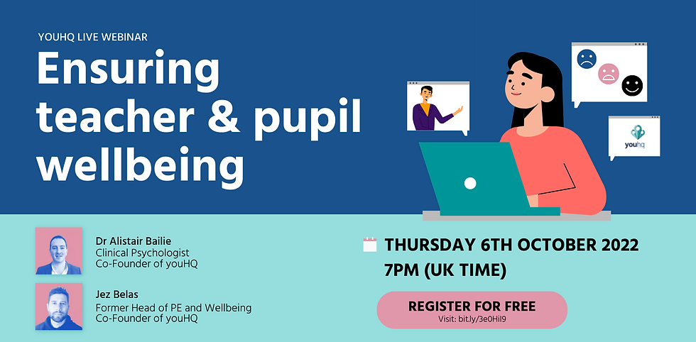
UPCOMING FREE WEBINAR: Ensuring Teacher & Pupil Wellbeing
- Sophie B

- Sep 23, 2022
- 1 min read
Updated: Dec 20, 2022
We're thrilled to invite you to our upcoming webinar on school wellbeing.
Hosted by Jez Belas (teacher and youHQ co-founder) and Dr Alistair Bailie (clinical psychologist), the webinar will educate attendees on staff wellbeing strategies in schools, values-based goalsetting, and more.
We can't wait to see you there! Secure your place by registering today: bit.ly/3e0HiI9
This article was created by the team behind youHQ, a school wellbeing and personal development platform.
We believe in helping the mental health of teachers and students through values-based goalsetting and the wellbeing support. Our cutting-edge app is changing the way schools care for their people.


Nice post.
Nice post.
Starting off, I’m from the UK and found this one after clicking through a random banner while reading sports news. Normally I ignore those, but this time I gave it a chance. The layout felt simple enough to get into without confusion. While browsing different sections, I ended up opening Betti Casino from a discussion thread. I had a rough beginning and was close to quitting, but then things turned around with a couple of lucky spins that actually covered my losses.
Hey everyone, UK forum reader here. I saw a discussion in a Discord group about relaxing games after work, and someone shared 50 Crowns Casino. I decided to try it and liked how accessible the games were. Some are straightforward, others include little surprises like extra rounds. I didn’t win much at first, but eventually I hit a good combination that made me stay longer than planned.
Hey everyone, UK forum reader here. I saw a discussion in a Discord group about relaxing games after work, and someone shared https://spinpin.org.uk/. I decided to try it and liked how accessible the games were. Some are straightforward, others include little surprises like extra rounds. I didn’t win much at first, but eventually I hit a good combination that made me stay longer than planned.